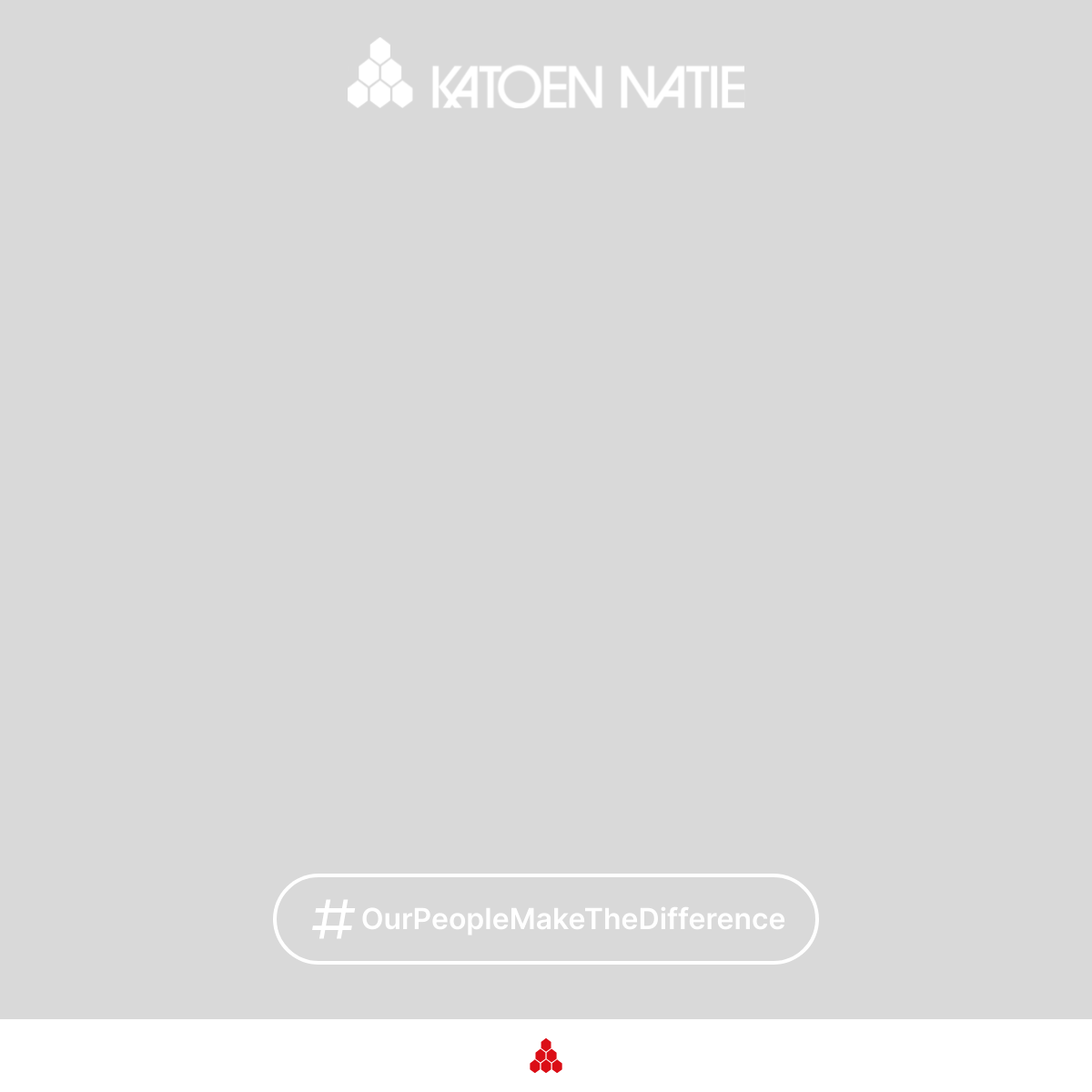
Manifesto
We operate as one strong group with a distinct identity. It lives in our culture and in our corporate style. Worldwide we are known for our expertise, professionalism and our customer-first attitude.
The Katoen Natie Brand
We are a strong group of companies with a strong identity. This identity is expressed in our corporate culture and our corporate style. We are recognised around the world for our professionalism and expertise, for our customer-centred, can-do attitude.
While it has taken us many decades to build up this reputation, we need to be instantly recognisable at first view. When people see our distinctive red logo, they need to know that they can depend on the people wearing it and on the trucks bearing our banner. They need to know that they can rely on the know-how and professionalism that stand behind the warehouses and facilities.
They must also be reassured that these values and these high standards are the same throughout the company, around the world. They must be confident that this quality is maintained from year to year, and even from decade to decade.
This is why it is so important to maintain visual uniformity in everything we do. We look the same and act the same, all over the world. We make the rules, but we also keep to the rules. Customers know this, and they appreciate it.
The style manual that you are holding in your hands lays down the visual rules. For our logo, our colours, our flags, our documents and everything else that identifies us to the outside world.
It is vital for these rules to be strictly applied everywhere. On our clothing and uniforms. On our vehicles and equipment. On our warehouses and facilities. On our documents, communication and correspondence.
This style manual will help you to achieve this. It is meant as a facilitating tool, to help you in your task. I warmly recommend that you should consult it whenever needed. In fact, I require it.
I hope that this manual will prove very useful to you, and thank you in advance for its correct and intensive use.
Fernand Huts
President Katoen Natie
Principles
Our design principles guide every decision we make. They help us distinguish every element and every experience designed by Katoen Natie.
Think → Guide
We think strategically about our brand and guide its application consistently across all touchpoints.
Build Bonds
This is the guiding ethos behind Katoen Natie's design philosophy. We build lasting relationships through consistent, professional communication.
Customer Focus
Every design decision prioritizes our customers' needs and our commitment to delivering value.
Who We Are
Katoen Natie is a global logistics and applied engineering provider. We combine engineering, technology, and port operations to offer worldwide, tailor-made solutions to the chemical and automotive industries, and to the consumer goods, electronics & retail sector.
With operations in over 30 countries and a heritage dating back to the 19th century, we are headquartered in Antwerp, Belgium. Our long-term vision, engineering integration, and unwavering commitment to our clients define who we are.
Mission & Vision
Our Mission
The mission of the company is simple: creating maximum added value. Katoen Natie creates maximum value by providing tailor-made, full service logistics and engineering solutions to a key number of customers, all over the world.
Our Vision
To be the preferred global partner in end-to-end logistics and engineering solutions for the world's specialised supply chains.
Our Values
Customer Focus
We put our customers at the heart of everything we do, creating the maximum added value through proven solutions and long term partnerships.
Commitment
We deliver on our promises, ensuring operational excellence and safety every day. We continuously improve our processes and technology to stay ahead in a changing world.
Flexibility
We own and operate large multi-customer platforms guaranteeing the necessary flexibility to cope with seasonality and capacity for future growth. We continuously improve our processes and technology to stay ahead in a changing world.
Our employee values
Brand Elements
The core visual components that define our brand identity.
Logo
The Katoen Natie logo is the most visible element of our identity. It must be used consistently and correctly across all applications.
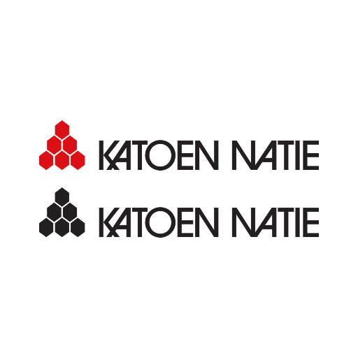
The Katoen Natie Logo + Baseline
The standard logo consists of:
- Honeycomb emblem
- Word marque
- Baseline
ktn-logo-colour
ktn-logo-black
ktn-logo-horizontal
The Katoen Natie Logo
The logo without baseline may be used in limited circumstances to increase readability:
- internal use
- limited space
ktn-logo-centre
ktn-logo-centre-black
ktn-honeycomb
The Katoen Natie Logo Horizontal and Vertical
As a rule, the standard logo should be used. However, when space does not permit, the logo can be used in a horizontal or square version (on buildings, clothing etc).
Horizontal Logo
Vertical/Square Logo
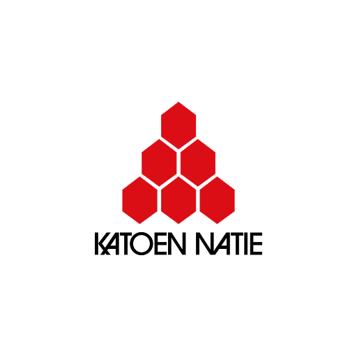
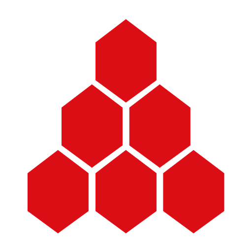
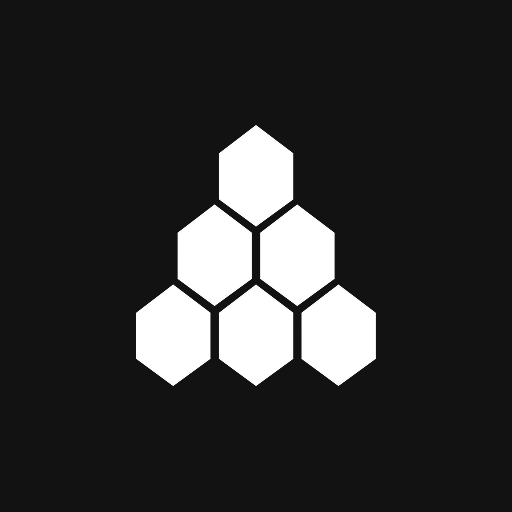
Honeycomb Emblem
With the triangle as an archetype, the emblem represents a beehive with honeycombs.
The six areas represent the original 6 activities of the old 'natie.' The red stands for dynamism, combined with the white it refers to the Antwerp roots of the group.
This emblem can be used as a graphical element when applying the full logo is not possible.
To ensure the Katoen Natie brand is always clear and consistent, we have established the following minimum sizes for print and digital applications.
min. 10 mm
min. 35 px
Honeycomb (colour)
Honeycomb (black)
Do's and Don'ts for the Honeycomb Icon
The emblem must be used with full colouring, in red or white.
Not allowed: outlines, deformation, tilting, deconstructing the honeycomb, inserting photos in the honeycomb.
White on red
White on black
White on grey
No grey colour
No tilting
No deformation
No outlines
No deconstructing
No photos in honeycomb
Colour
Our colour palette is bold and recognisable. The primary red and black represent our energy, professionalism, and commitment to excellence in logistics and engineering.
Primary Colours
Two corporate colours express the Katoen Natie identity. These primary colours are red and black.
We use colours both to differentiate our brand and to keep it consistent. The more consistent the use of our colours, the easier people will be able to recognise us as a brand.
Katoen Natie Red
Black
Fuller Black for Print: When printing large areas of black, we suggest adding 50% cyan to 100% black. This results in a "fuller" black.
Fuller Black
Secondary Colours
To support the basic colours black and red, two kinds of grey are available. These neutral colours can be used for coloured backgrounds, tables and other details.
Light Grey
Dark Grey
Supporting Colours
The primary colour red can easily be mistaken as an error state. Therefore, use teal as a complementary colour for functional purposes. Examples are links and active states of form elements.
Teal
Do's and Don'ts
Colour gradients are not permitted.
When using text on coloured backgrounds, don't use grey text. Only white text is allowed on black or red backgrounds.
No red text on black background
No grey text on black background
White text on black background
No black text on red background
No grey text on red background
White text on red background
Digital Apps Colours
For digital applications and user interfaces, we use the Hexagon Design System. This comprehensive colour system provides a complete palette optimised for digital screens, ensuring consistency across all Katoen Natie applications.
The Hexagon Design System includes primary colours, semantic colours, neutral greys, and accessibility-compliant colour combinations specifically designed for digital interfaces.
Typography
Typography is fundamental to how we communicate. Our typeface selection and usage reflect our commitment to clarity, professionalism, and accessibility.
Typography for Graphical Work
The standard typeface is the ITC Avant Garde Gothic font. This font is used for all external communication: brochures, folders, flyers etc. Entire texts in capital letters are only used in cover titles or tables.
ITC Avant Garde Gothic Bold
Font Weight Guidelines
ITC Avant Garde Gothic offers multiple weights, but for optimal readability and professional appearance, we recommend using only three weights in your designs:
Bold
Use for: Large titles on print materials, hero sections, cover pages, and prominent headlines that require maximum visual impact.
When: When you need strong emphasis and the text is displayed at larger sizes (typically 24pt and above). Bold creates clear hierarchy and draws attention to key messaging.
Regular (Book)
Use for: Body text, paragraphs, descriptions, and all standard reading content in brochures, flyers, and printed materials.
When: For all extended reading content. Regular weight provides optimal readability at standard text sizes (typically 9-14pt) and ensures comfortable reading experience.
Medium
Use for: Smaller captions, subheadings, labels, and supporting text that needs slight emphasis without being as heavy as Bold.
When: For captions, photo credits, table headers, and secondary information that requires subtle distinction from body text.
Avoid: Light & Extra Light
Why: Light and Extra Light weights should be avoided due to readability concerns. These weights can appear too thin, especially at smaller sizes or when printed, making text difficult to read and potentially appearing unprofessional.
Impact: Thin weights reduce legibility, particularly for audiences with visual impairments or when viewing from a distance. They also may not print clearly on all paper types and printing methods.
Typography Office Documents
When ITC Avant Garde Gothic is not available or cannot be used, we suggest the common font Arial, available on all IT systems. This is for example applicable to Office documents: Word, PowerPoint etc.
Arial Regular
Arial Bold
Typography for Digital Apps
For digital applications and user interfaces, we use Roboto. This modern, versatile typeface ensures excellent readability across all screen sizes and devices.
Roboto
Tone of Voice
Our voice is professional, direct, and confident. We avoid jargon where possible and speak plainly to our partners.
Writing Style
British English spelling is used across all communications; American English spelling is applied only for content specifically intended for the USA.
Do
- Be clear and concise
- Focus on solutions and benefits
- Use active voice
- Write for your audience
Don't
- Use overly complex language
- Be passive or vague
- Use jargon unnecessarily
- Write in a condescending tone
Photography
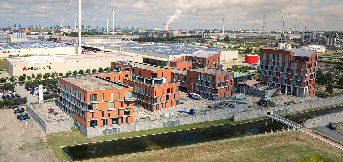
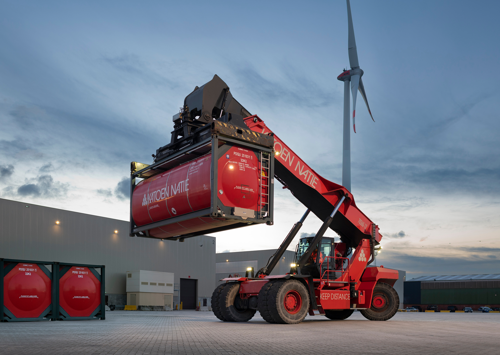
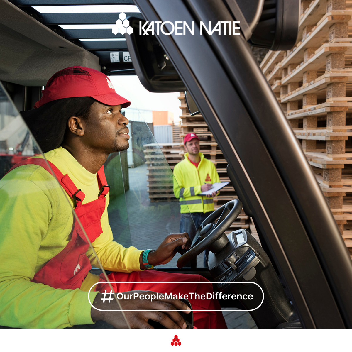
What makes a Katoen Natie image a Katoen Natie image? It's subjective. But, if we are to guide, as our design philosophy suggests, the photography we use gives us the opportunity to present ourselves as great observers of the working world and to show and tell stories. Our photography should set the scene or create context for the transformational conversations we want to have. It should demonstrate our interest in the world around us, and the positive effects we're working to deliver as Katoen Natie.
Everything communicates, and our use of imagery is no exception. The care and craft we put into our imagery choices demonstrates our commitment to best-in-class communication and a celebration of the work we do.
Tips and Techniques
When choosing or creating a Katoen Natie image, certain criteria should be considered:
- Perspective: Use eye-level to treat clients as equals, or aerial to show scale and impact.
- Composition: Use the 2x Grid to establish clear focal points and create visual rhythm.
- Lighting: Use natural light whenever possible. Avoid artificial gels or over-dramatized studio lighting.
- Authenticity: Avoid metaphors and clichés. If an image looks like generic stock, don't use it.
Photography Gallery

Videography
Overview
Professional standard first Our communication should always reflect a professional, high-quality image. Whenever possible, visuals should be created by professional photographers or media specialists.
Smartphone photos Smartphone photos should not be used for external communication (website, LinkedIn, brochures, presentations for clients), unless explicitly approved by the communication or media team. Internal or operational use may allow exceptions.
Authenticity over decoration Images should reflect real people, real work, and real environments. Avoid visuals that feel staged, artificial, or like generic stock photography.
Tips and Techniques
Perspective
- Use eye-level views when photographing people to show equality, respect, and approachability.
- Use higher or aerial views only when the goal is to show scale, structure, or operational impact (e.g. warehouses, terminals, infrastructure).
Composition
- Keep the image clear and structured.
- Make sure it is immediately obvious what the image is about.
- Avoid cluttered scenes, distracting backgrounds, or unclear focal points.
(Rule of thumb: if you cannot explain what the photo shows in one sentence, it is probably not suitable.)
Lighting
- Prefer natural light whenever possible.
- Avoid dramatic studio lighting, colored lights, or effects that look artificial.
- The image should feel realistic and credible, not theatrical.
Sharpness and Clarity
- Images should be sharp and clear across the frame.
- Avoid blurry, soft, or heavily stylized images.
- Clarity communicates precision, safety, and professionalism.
What to Avoid (Simple Checklist)
Do not use images that are:
- Blurry, dark, or poorly lit
- Over-edited or heavily filtered
- Taken casually with a smartphone for external communication
- Generic stock images that do not represent Katoen Natie
- Overly dramatic, symbolic, or abstract
- Confusing or visually crowded
When in Doubt
If you are unsure whether an image is suitable:
- Do not publish it immediately.
- Contact the communication or media team for review.
- It is better to delay than to damage the company's visual identity.
Camera Specs
To maintain a premium brand aesthetic, all video content should be captured using the following resolution and aspect ratio guidelines. These specifications ensure professional quality and compatibility across various digital platforms.
Landscape (16:9)
Landscape is our primary format for website hero backgrounds, YouTube, and traditional presentations.
- 4K UHD (Recommended): 3840 x 2160 pixels - Preferred standard for maximum clarity and future-proofing
- Full HD: 1920 x 1080 pixels - Standard HD quality, used when file size or processing speed is a priority
- HD (Minimum): 1280 x 720 pixels - Acceptable minimum for web content
Best For: Website banners, brand manifestos, YouTube videos, and long-form educational content.
Portrait (9:16)
Portrait format is essential for social media integration and mobile-first experiences.
- Vertical HD (Recommended): 1080 x 1920 pixels - Standard vertical HD, ensures video fills entire screen on modern smartphones
- 4K Vertical: 2160 x 3840 pixels - High-fidelity vertical format, useful for high-end vertical advertisements or when heavy cropping is required
Best For: Instagram Reels, TikTok, YouTube Shorts, and mobile-specific landing pages.
Additional Technical Standards
To ensure visual consistency with our "detail-oriented" and "sharp focus" brand pillars:
Frame Rate:
- 24fps: For a cinematic, narrative feel (Brand films/Manifestos)
- 30fps: For standard web content and interviews (Clear and natural motion)
- 60fps: Only used for action shots or when slow-motion is required in post-production
Format & Quality:
- Format: MP4 (H.264 codec) for delivery
- Bitrate: Minimum 20 Mbps for 1080p; 60 Mbps or higher for 4K to prevent compression artifacts
- Colour Profile: Capture in "Neutral" or "Log" profile if professional colour grading will be applied; otherwise, use Rec.709 for immediate web compatibility
- Audio: AAC codec, 48kHz sample rate minimum
Video Captions
Video Caption (Subtitle) Guidelines
Captions improve accessibility, engagement, and SEO. Follow these guidelines for optimal readability across all platforms.
General Principles
- Captions must be easy to read on all devices (desktop, tablet, mobile)
- They must accurately reflect what is being said
- Auto-generated captions are a starting point only and must always be reviewed and corrected
- Always proofread captions before publishing
Text Styling
- Font Size: 16px minimum for readability across all devices
- Font Style: Sans-serif fonts (Arial, Helvetica, or Roboto) for clarity
- Text Colour: White text for maximum contrast
- Background: Semi-transparent black background (80% opacity) or solid black
- Border/Outline: Black border or stroke (2-3px) around text for readability on light backgrounds
- Alignment: Centre-aligned for standard videos
- Position: Bottom centre of video frame, with safe margin from edges
Text Length & Formatting
- Maximum 2 lines per caption block
- 32-42 characters per line for optimal readability
- Break at natural pauses (commas, periods) not mid-word
- Keep captions short and readable rather than exact word-for-word transcripts
- Break long sentences across two lines naturally
Timing & Synchronization
- Captions must appear in sync with speech
- Display each caption for 2-7 seconds depending on reading speed
- Each caption should stay on screen long enough to be comfortably read
- Avoid captions flashing too quickly or staying on screen after speech ends
Best Practices
- Always review auto-generated captions for accuracy
- Ensure captions are synchronized with speech
- Use proper punctuation and capitalization
- Use correct spelling and adapt captions to the spoken language used in the video
Authenticity
- Avoid clichés, metaphors, and overused visual concepts.
- If an image looks like something taken from a stock photo website, it should not be used.
- People should appear natural and engaged in real activities, not posed or exaggerated.
Safety & Privacy
Safety and Compliance (Very Important)
Images must always reflect correct and safe behavior.
- All visible people must wear the correct PPE for the environment (e.g. safety shoes, helmets, fluo vests, gloves).
- Unsafe behavior must never be shown, even if it looks dynamic or visually appealing.
- Machinery, vehicles, and workflows must appear compliant with internal safety rules.
Why this matters: Images are often reused in presentations, audits, or external communication. A single unsafe detail in a photo can raise questions or create reputational risk.
Privacy and Data Protection (GDPR)
- Avoid showing names, personal data, screens, badges, or documents that contain sensitive information.
- Employees should not be clearly identifiable in external communication unless consent is given or it is part of an approved shoot.
- Licence plates, screens, and paperwork should be hidden, blurred, or avoided.
Simple rule: If personal or confidential information is visible, the image should not be used.
Context
Context and Purpose
Every image should have a clear reason to exist.
- Ask: What is this image communicating?
- Images should support a message, not exist just to "fill space."
- Avoid posting or sharing visuals without a clear context or explanation.
If an image needs a long explanation to make sense, it is probably not the right image.
Brand Consistency
- Images should align with the Katoen Natie brand values: reliability, precision, scale, expertise, and long-term partnerships.
- Avoid visuals that feel playful, ironic, chaotic, or trendy for the sake of trends.
- The tone should be calm, confident, and credible.
This helps ensure that images across locations, countries, and teams still feel like "one company."
Iconography
Icons are visual symbols that represent actions, objects, or concepts. They should be clear, consistent, and immediately recognisable.
UI Icons
Icons used in user interfaces should follow a consistent style and size system. They should be simple, recognisable, and scalable.
UI Icons are functional elements designed for digital applications, helping users navigate interfaces and understand actions quickly.
Business Icons
Business Icons serve as recognition and branding elements for different business units within Katoen Natie. Unlike UI Icons which are functional elements for digital interfaces, Business Icons are visual identifiers that help distinguish and represent specific business units, departments, or operational areas.
Key Differences:
UI Icons
- Functional elements for navigation and actions
- Used in digital applications and interfaces
- Standardised size and style system
- Help users understand interface functionality
Business Icons
- Recognition and branding elements
- Identify specific business units or departments
- Visual differentiation between units
- Support brand identity and unit recognition
Pictograms
Pictograms are specifically designed for applications with operators and drivers in mind. They serve as clear visual communication tools that transcend language barriers and provide immediate understanding of actions, warnings, or instructions.
Usage Guidelines:
- Always use with labels: Pictograms should always be presented in combination with a text label for excellent clarification and to avoid mistakes of interpretation. The combination of visual and text ensures clear communication.
- When to use: Pictograms are used when standard icons are too abstract or not clear enough for the intended audience. They provide more detailed visual information than simple icons.
- Size and placement: Pictograms are slightly bigger than standard UI icons and are typically used for navigation cards in registration flows and tickets that users receive when registered on site.
- Context: Ideal for operational environments where quick, unambiguous communication is critical, such as warehouse operations, driver interfaces, and safety instructions.
For more information or custom pictogram requests, please contact someone from the ICT Design team.
Illustrations
Illustrations are visual elements that add personality, context, and engagement to communications. Unlike icons and pictograms which are functional and standardised, illustrations provide creative expression while maintaining brand consistency.
When to Use Illustrations vs. Icons and Pictograms
Icons & Pictograms
- Functional, standardised symbols
- Used for navigation and interface elements
- Universal recognition and clarity
- Consistent size and style system
- Operational and technical contexts
Illustrations
- Creative, contextual visual elements
- Used to enhance storytelling and engagement
- Add personality and visual interest
- Flexible in style while maintaining brand identity
- Event invitations and internal communications
Usage Guidelines
- Primary Use: Illustrations are primarily used to enhance event invitations and internal communications. They help create a welcoming, engaging atmosphere for company events, celebrations, and internal announcements.
- Internal Focus: Illustrations are mostly for internal use, helping to make internal communications more engaging and visually appealing while maintaining a professional tone.
- Brand Consistency: While illustrations allow for creative expression, they should align with Katoen Natie's brand identity, using brand colours (RAL 3020 red and black) and maintaining a professional, approachable style.
- Context-Appropriate: Use illustrations when you want to add warmth, personality, or visual storytelling to communications. They work well for event themes, celebrations, and internal messaging that benefits from a more human touch.
- Complement, Don't Replace: Illustrations should complement text and other design elements, not replace essential functional elements like icons or pictograms in operational contexts.
- Quality Standards: Ensure illustrations are high-quality, scalable, and maintain clarity at various sizes. They should be professionally created or sourced from approved brand resources.
Illustration Examples

Our print materials maintain consistent branding across all physical communications. All print materials are to be printed in Pantone 1795 (red) and Pantone Process Black only.
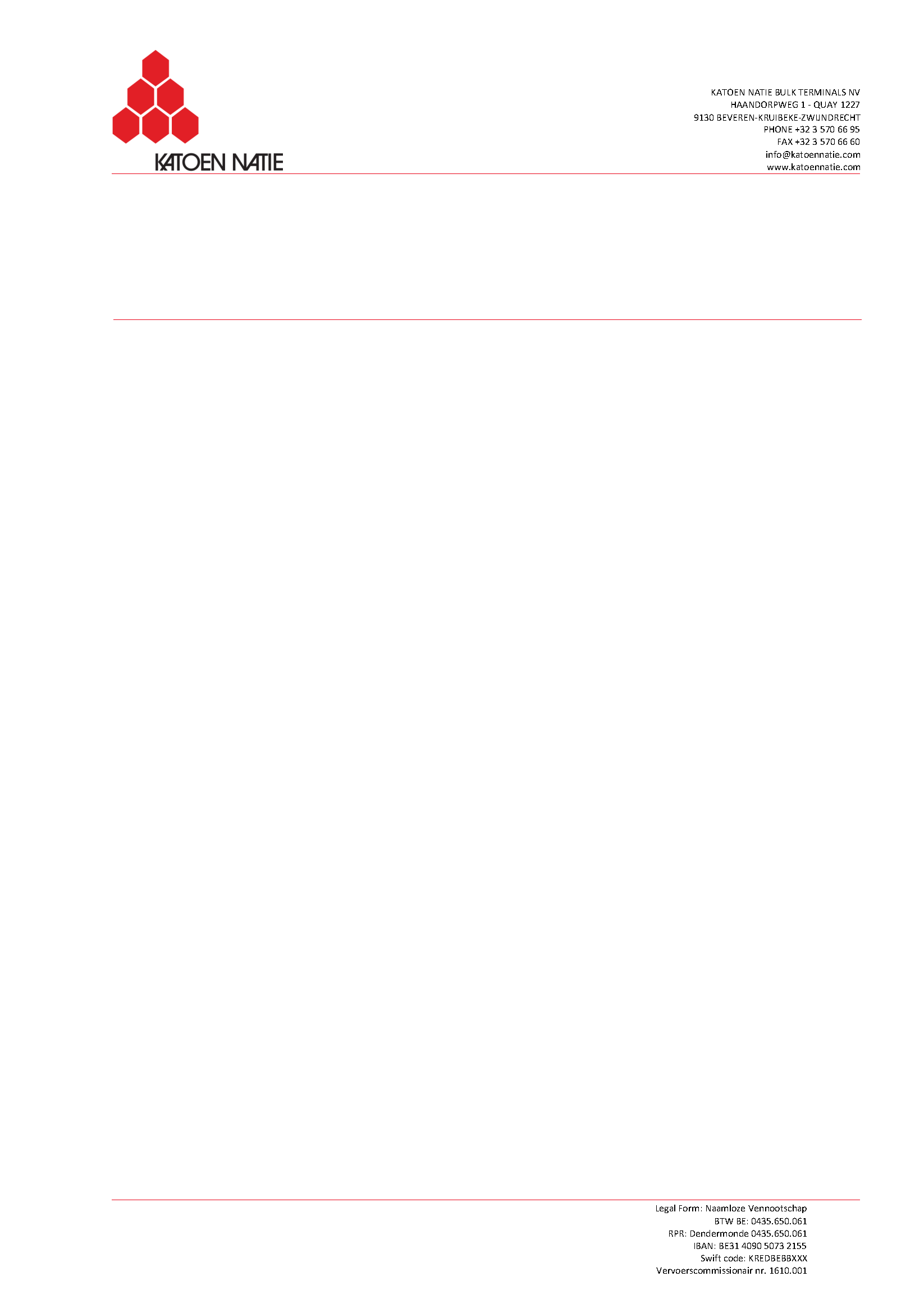
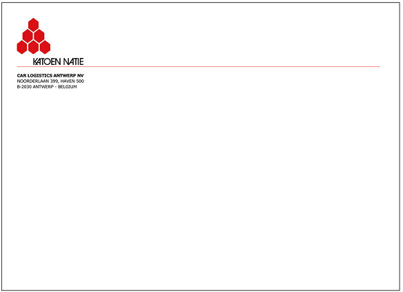
Letterhead
Each Katoen Natie company has its own personalized letterhead, based on the standard Katoen Natie letterhead.
All letterheads are to be printed in Pantone 1795 (red) and Pantone Process Black only.
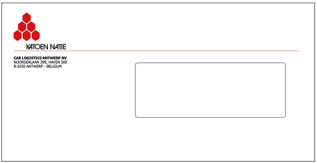
Envelopes
Each Katoen Natie company has its own personalized envelopes, based on the standard Katoen Natie envelopes.
All envelopes are to be printed in Pantone 1795 (red) and Pantone Process Black only.
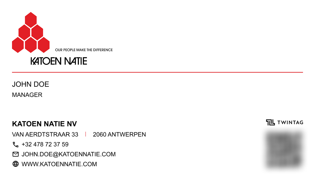
Business Cards
A fixed template is provided to design the Katoen Natie business cards.
All business cards are to be printed in Pantone 1795 (red) and Pantone Process Black only.
LinkedIn is ideal for professional content, industry insights, and B2B engagement. Share company updates, thought leadership, and behind-the-scenes content that showcases expertise and company culture.
Post Image
Dimensions: 1200 x 627 pixels (1.91:1 ratio)
Format: JPEG or PNG
Tips: Use clear, professional imagery. Keep text minimal and readable. Ensure important elements are centred as edges may be cropped on mobile.
Company Cover Image
Dimensions: 1128 x 191 pixels (5.9:1 ratio)
Format: JPEG or PNG
File Size: Max 4MB
Safe Zone: Keep important content within the centre area, as edges may be cropped on different devices
Tips: Use high-quality brand imagery. Keep text minimal and ensure logos are clearly visible. The banner appears at the top of your company page and should reflect your brand identity.
Personal Cover Photo
Dimensions: 1584 x 396 pixels (4:1 ratio)
Format: JPEG or PNG
File Size: Max 8MB
Safe Zone: Keep important content within the centre area, as edges may be cropped on mobile devices
Tips: Personal cover photos are for individual employee profiles. Use professional imagery that aligns with Katoen Natie branding. Avoid personal photos; opt for work-related or brand-appropriate visuals. Ensure any text is readable at small sizes.
Instagram excels with visual storytelling through photos, reels, and stories. Use a mix of content types to maintain engagement: educational reels, behind-the-scenes stories, and high-quality feed posts that showcase your brand.
Feed Post
Dimensions: 1080 x 1350 pixels (4:5 ratio)
Format: JPEG or PNG
Tips: Portrait format takes up more screen space and is ideal for showcasing people, products, or detailed visuals. Great for storytelling. Ensure content is engaging and aligns with brand guidelines.
YouTube
YouTube is the platform for longer-form content, tutorials, and brand storytelling. Focus on creating valuable, searchable content with compelling thumbnails that drive clicks and engagement.
Video Thumbnail
Dimensions: 1280 x 720 pixels (16:9 ratio)
Format: JPEG, PNG, or GIF
File Size: Max 2MB
Tips: Use high-contrast, eye-catching imagery. Include minimal, bold text. Faces and emotions perform well. Avoid cluttering with too much information. Test different thumbnails for the same video.
Channel Art (Banner)
Dimensions: 2560 x 1440 pixels (16:9 ratio)
Format: JPEG or PNG
Safe Zone: Keep important content within 1546 x 423 pixels (centre area)
Tips: Design for multiple device sizes. Important text and logos should be in the centre safe zone. Use brand colours consistently. Update regularly to reflect current campaigns.
Video Upload Specifications
Resolution:
- Minimum: 1280 x 720 pixels (720p HD)
- Recommended: 1920 x 1080 pixels (1080p Full HD)
- Best: 3840 x 2160 pixels (4K)
Format & Settings:
- Format: MP4 (H.264 codec)
- Frame Rate: 24, 25, 30, or 60 fps
- Aspect Ratio: 16:9 (standard) or 9:16 (Shorts)
- Audio: AAC codec, 48kHz sample rate
Tips: Upload in the highest quality available. YouTube will process multiple quality versions. Use consistent branding in intros/outros. Include captions for accessibility and SEO.
Video Titles
Character Limit: Keep titles under 60 characters for optimal display. YouTube truncates longer titles with "..." in search results and on mobile devices.
Typography: Use ITC Avant Garde Gothic Medium (for graphical work) or Arial (for office documents) in capital letters, following our brand typography guidelines.
Best Practices:
- Be clear and to the point - front-load important keywords
- Use active, engaging language that encourages clicks
- Avoid clickbait - maintain authenticity and accuracy
- Include relevant keywords for discoverability
- Keep it concise - every word should add value
- Test different titles to see what performs best
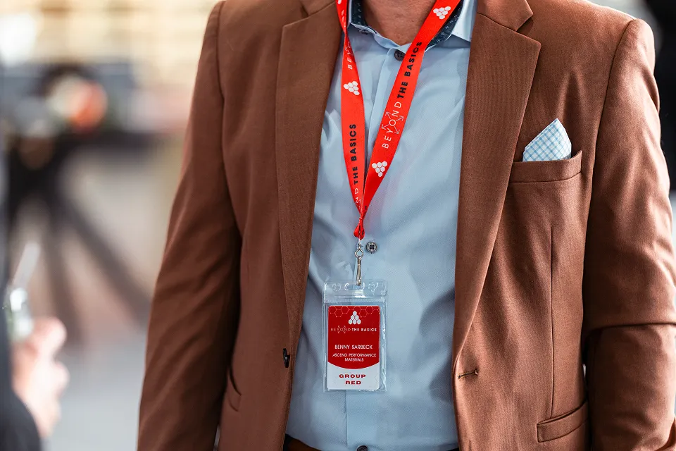
Name Cards (Lower Thirds)
Name cards identify speakers and add professionalism to your videos. Follow these guidelines for consistent branding.
Position: Always place name cards in the left bottom corner of the screen, with safe margins from edges (minimum 5% from left and bottom).
Typography: Use Katoen Natie typography guidelines:
- Font: ITC Avant Garde Gothic Medium (for graphical work) or Arial (for office documents)
- Style: Capital letters, following the 30 units grid system
- Size: Ensure readability on all screen sizes (minimum 24px for name, 18px for profession)
Format: Two-line layout:
- Line 1: Full Name (e.g., "JOHN SMITH")
- Line 2: Profession/Title (e.g., "LOGISTICS MANAGER")
Styling:
- Background: RAL 3020 (Katoen Natie Red) or semi-transparent black overlay
- Text Colour: Reflecting white for maximum contrast
- Padding: Adequate padding around text (minimum 8px)
- Duration: Display for 3-5 seconds, or for the duration of the speaker's segment
Best Practices: Keep name cards simple and uncluttered. Ensure they don't obstruct important visual content. Use consistent positioning across all videos. Test readability on mobile devices.
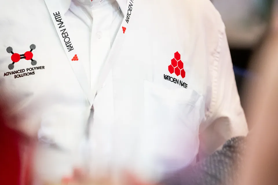
Miscellaneous
Additional brand applications including clothing, fleet vehicles, equipment, and premises. These guidelines ensure consistent branding across all physical touchpoints.
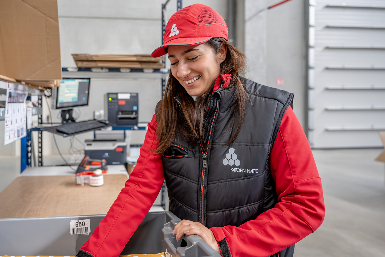
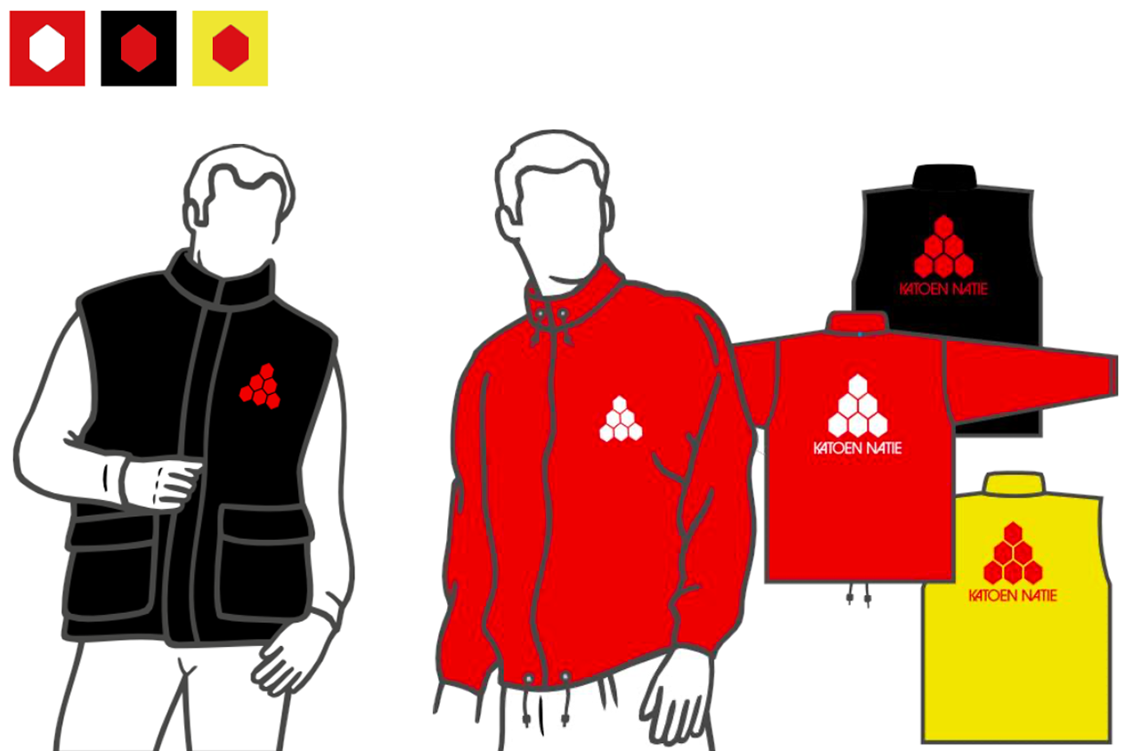
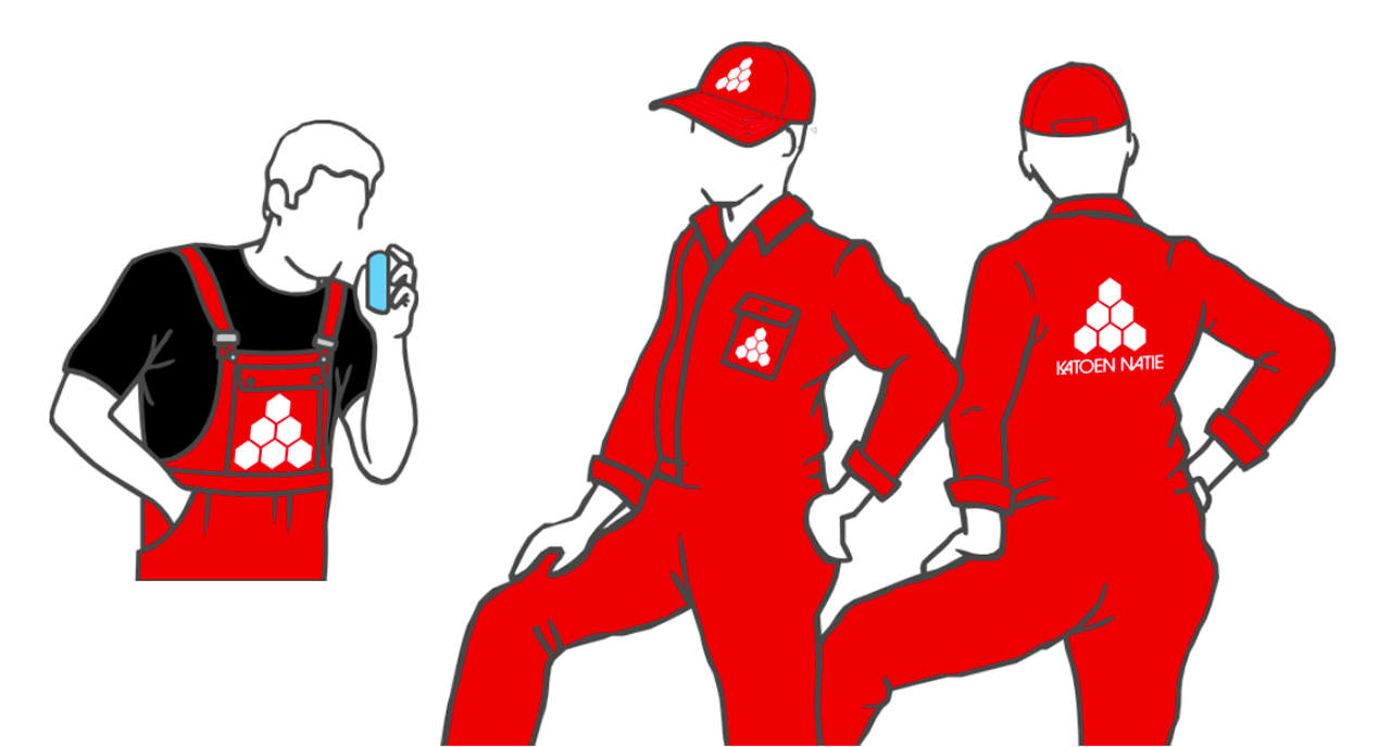
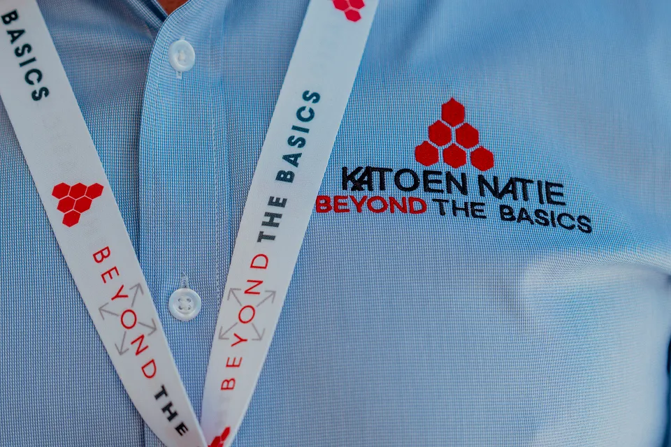
Clothing
Always follow these guidelines for clothing.
Colour codes for clothing are an exception to the standard guidelines.
Fleet
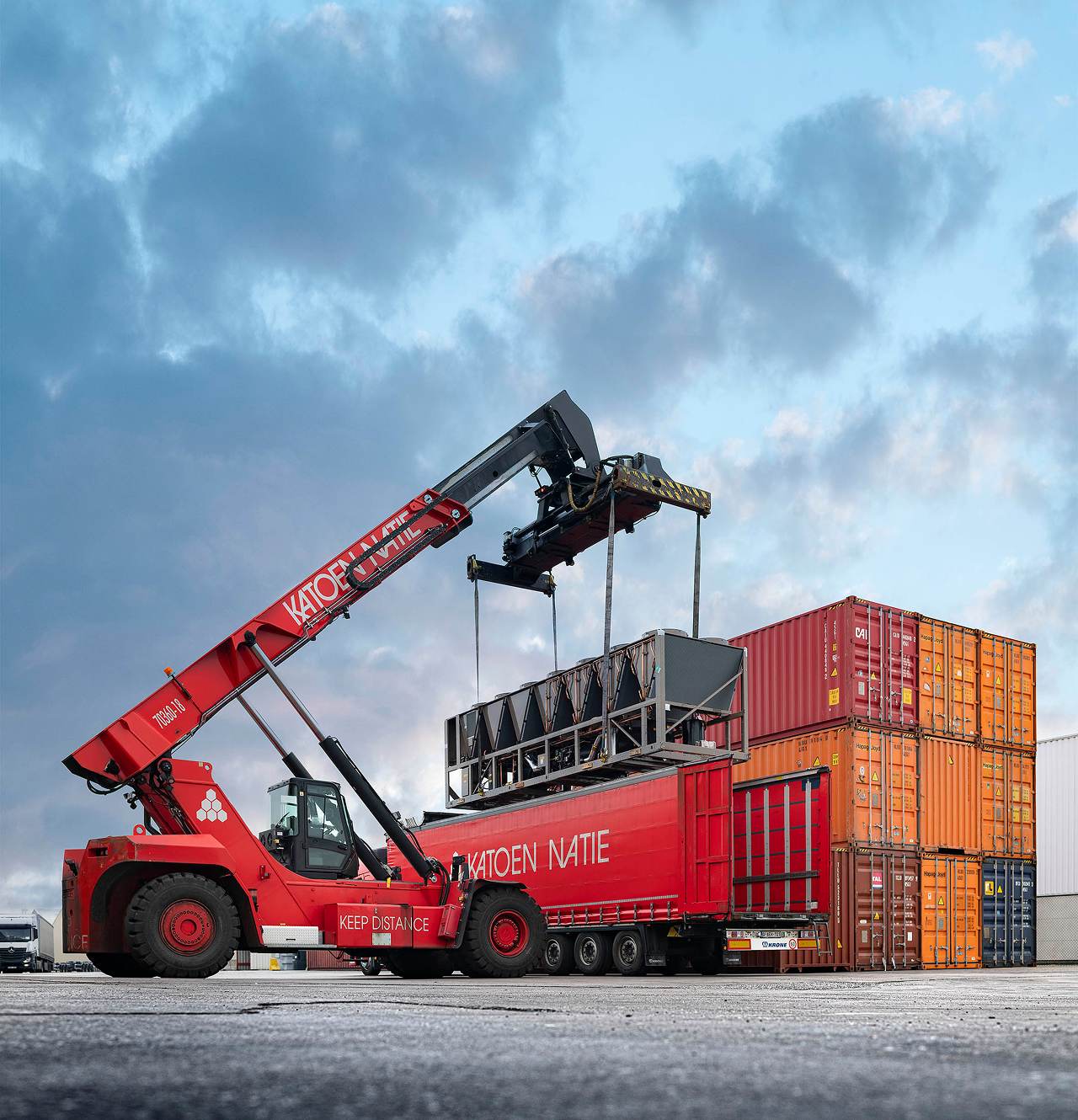
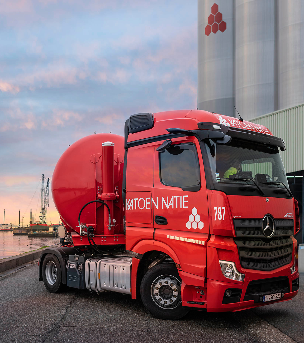
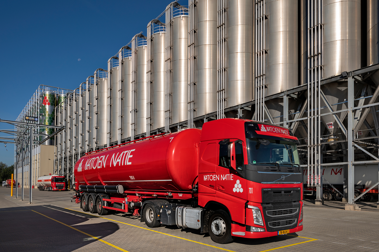
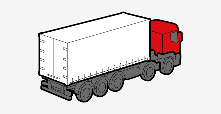
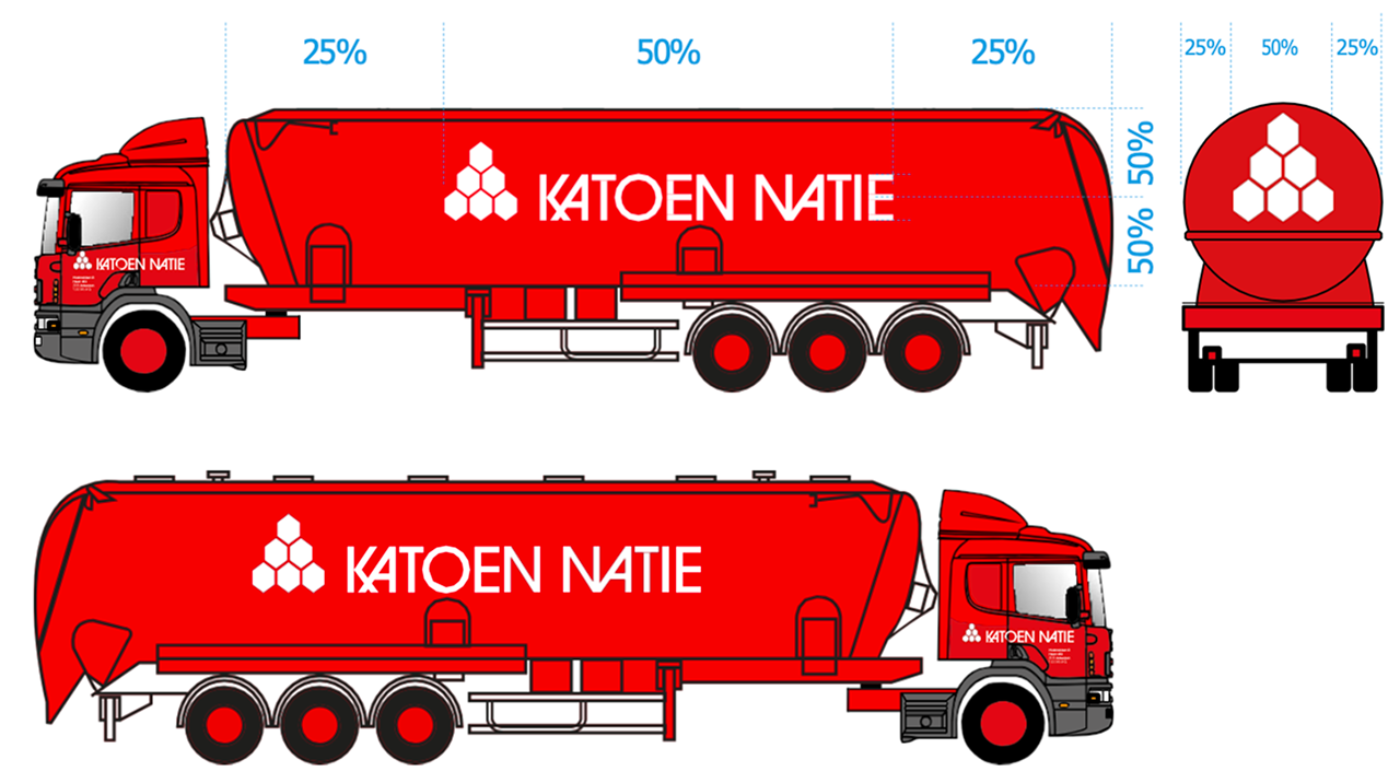
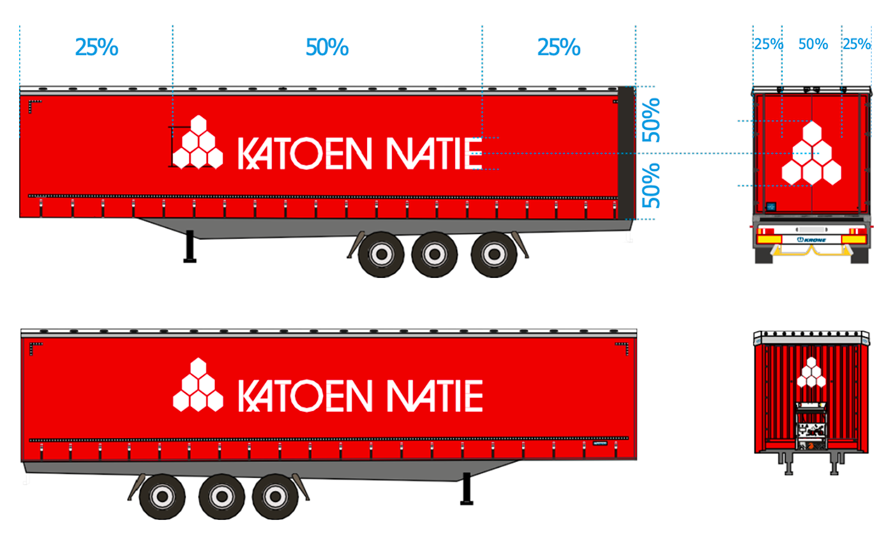
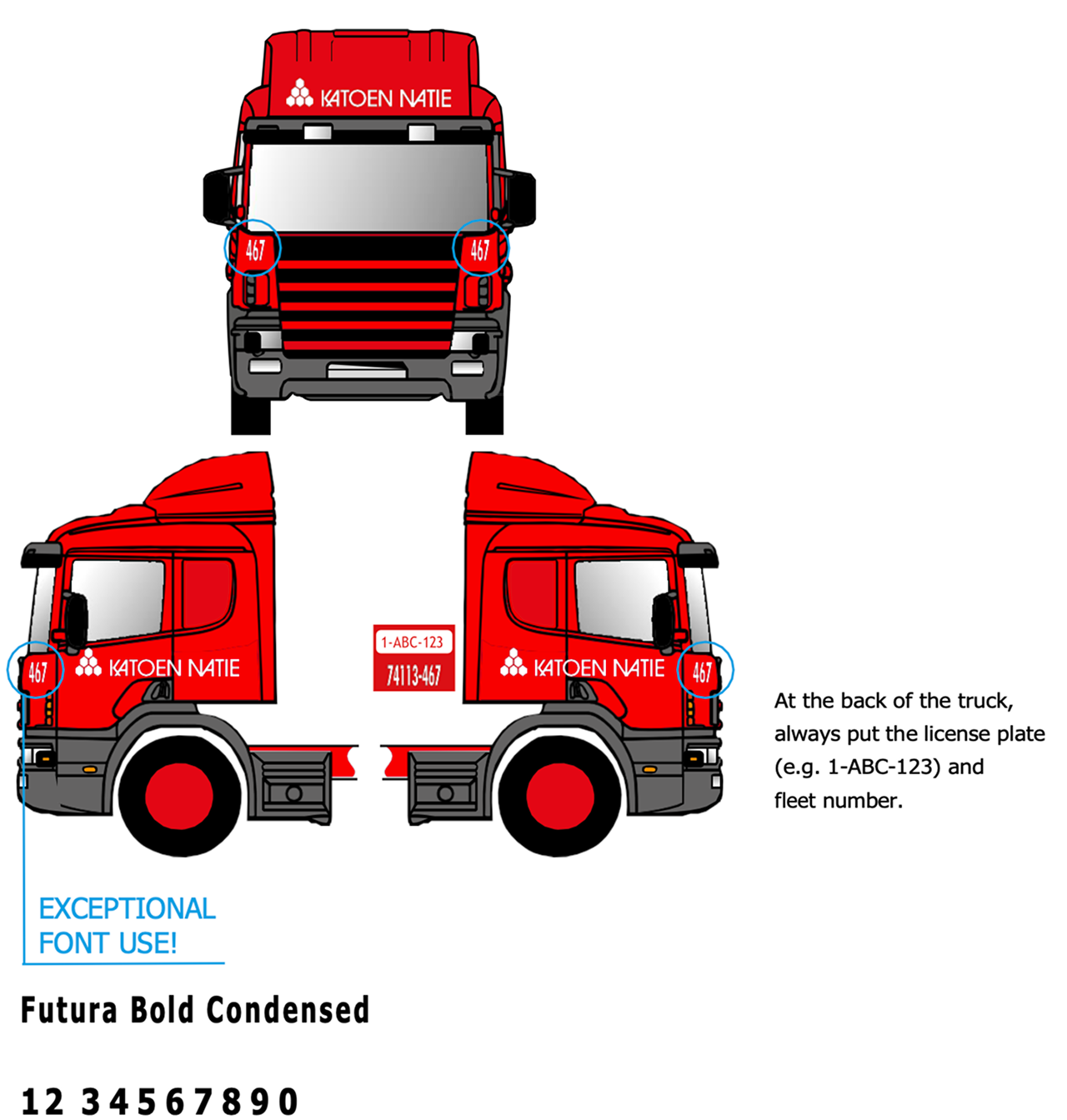
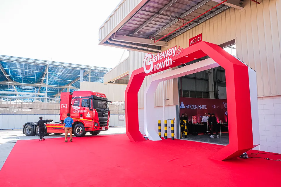
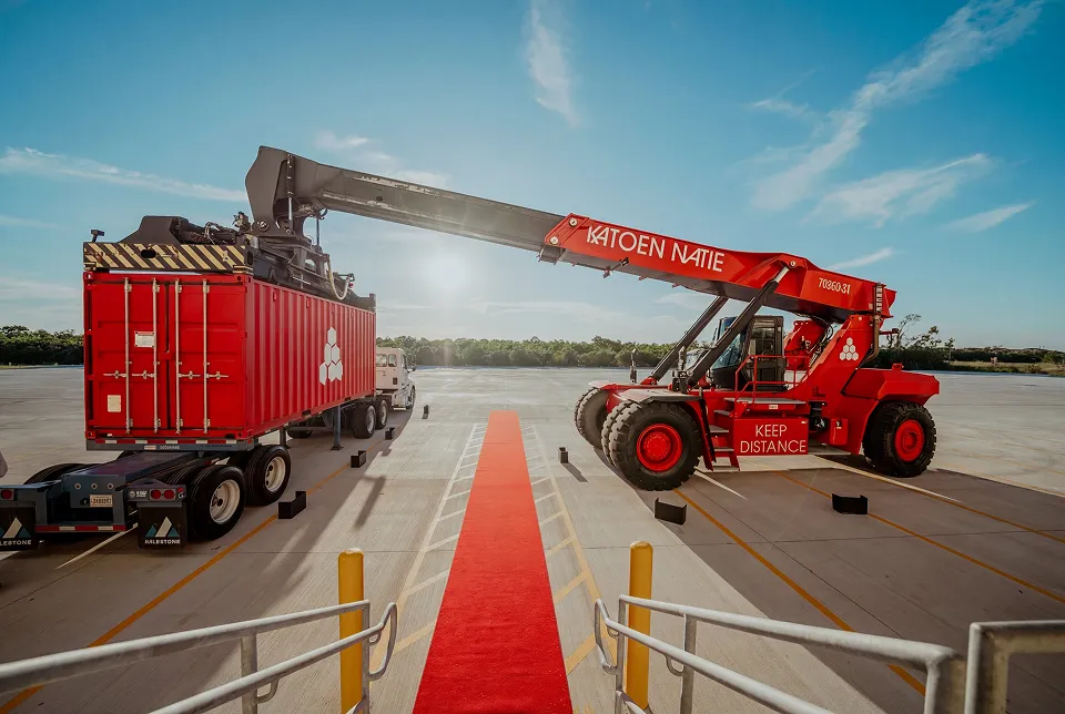
The Katoen Natie vehicle fleet is always painted in the standard red colour, with a white logo and texts.
On trailers the horizontal logo is used, always at 50% of the total length of the trailer.
On the front of the trucks, exceptionally the font Futura Bold Condensed can be used for the truck code.
At the back of the truck, always put the licence plate (e.g. 1-ABC-123) and fleet number.
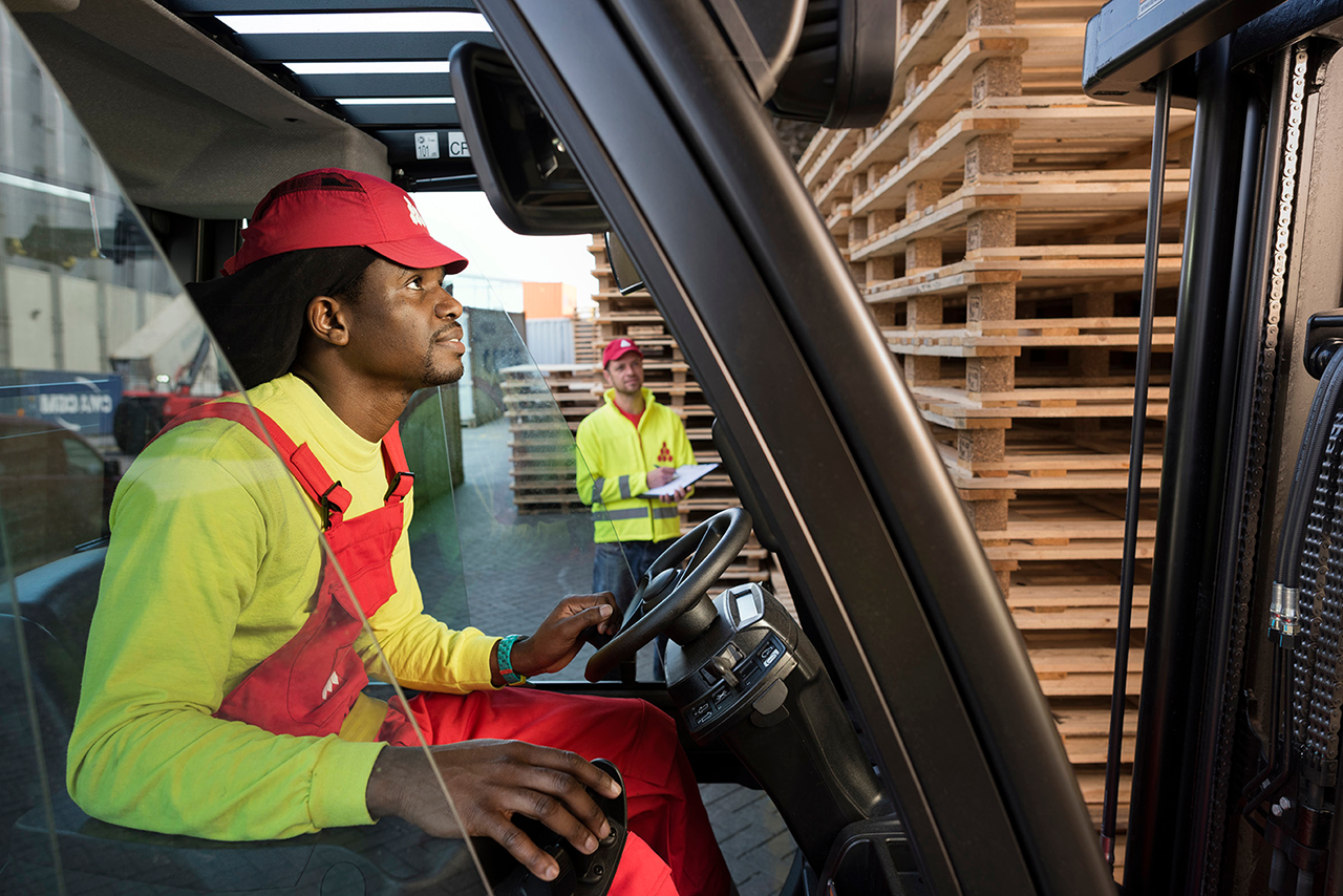
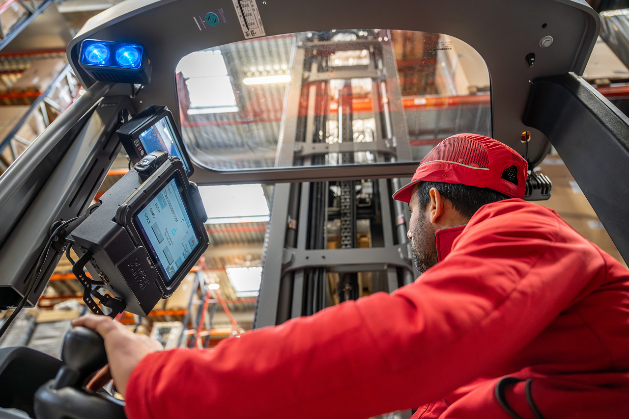
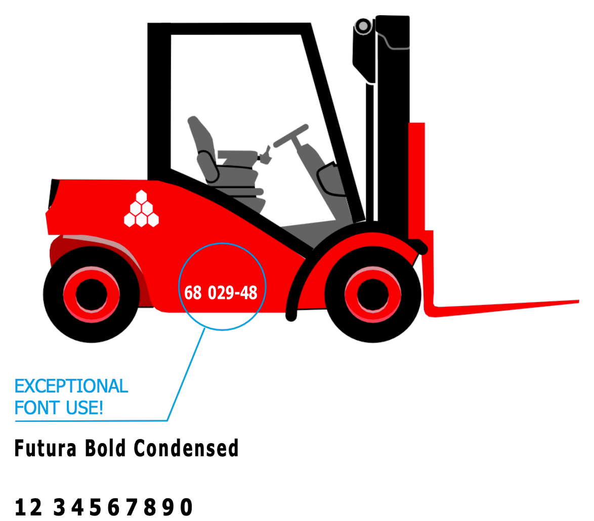
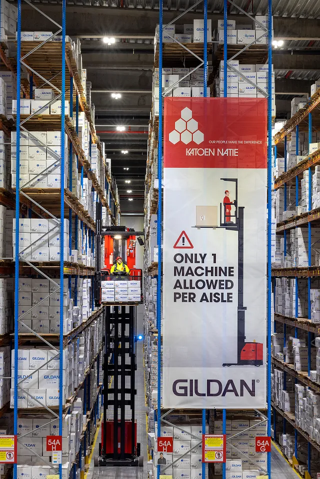
Forklifts
Forklifts and other equipment should follow the same branding guidelines as the fleet vehicles. Use the standard red colour with white logo and text placement.
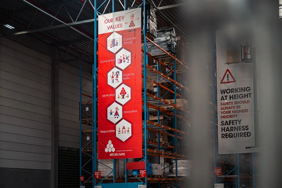
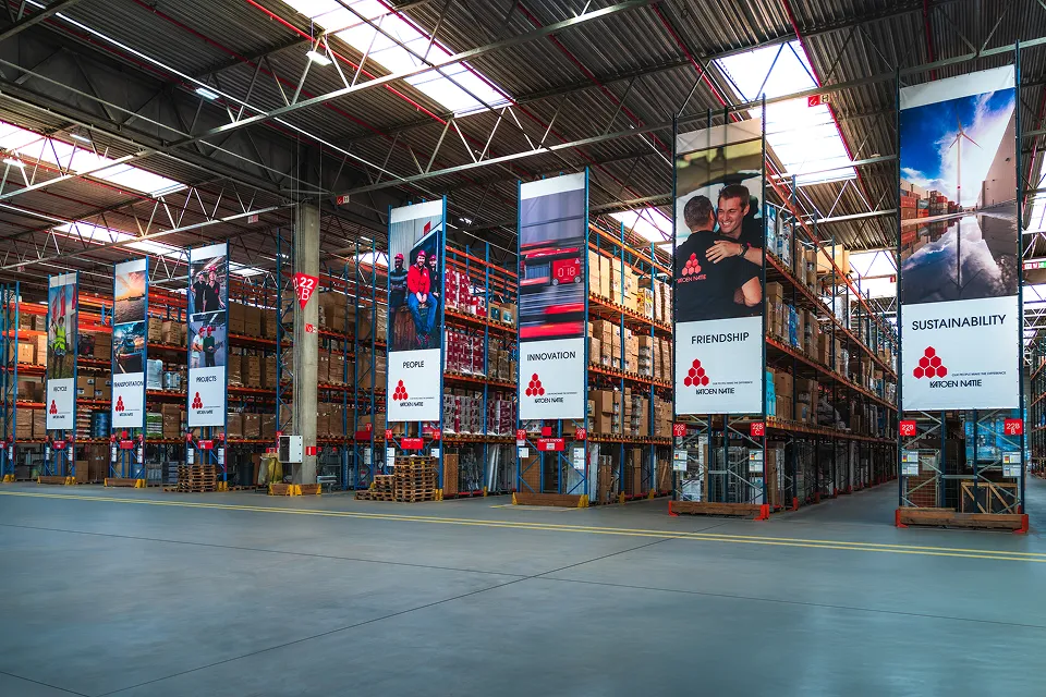
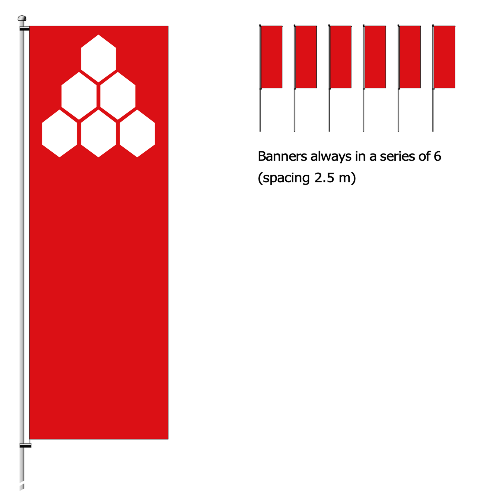
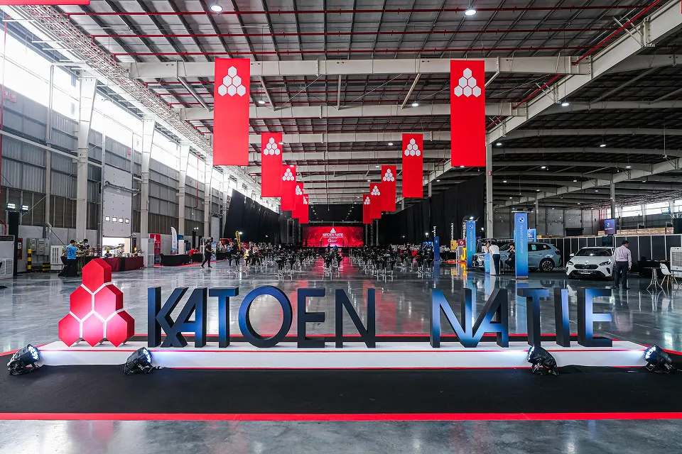
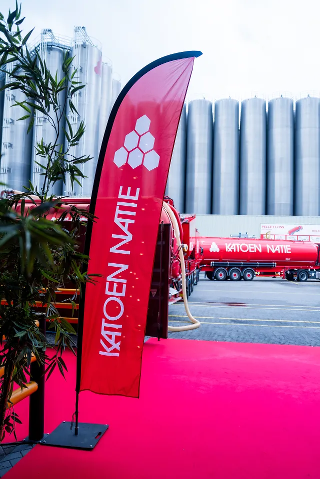
Banners
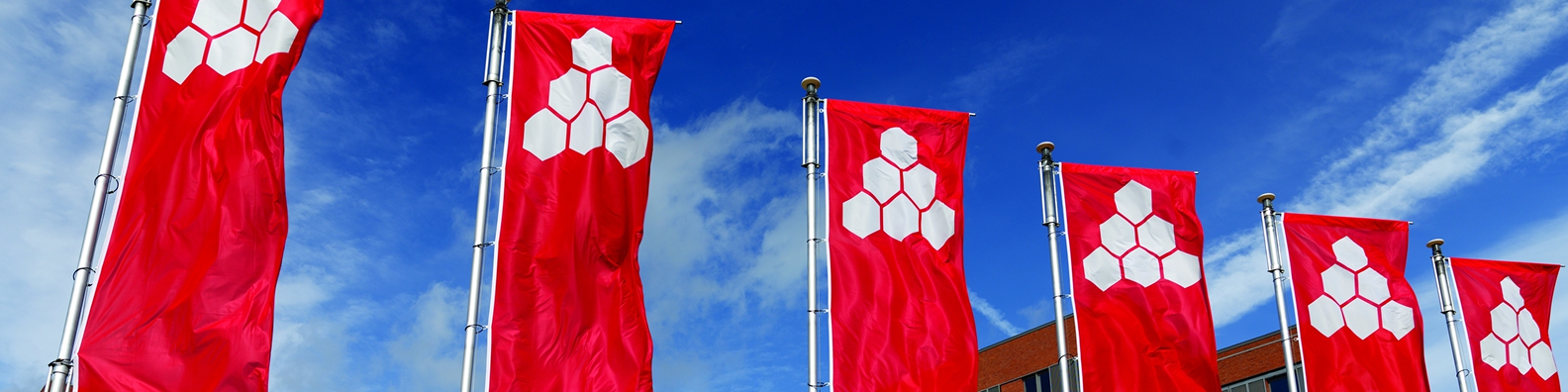
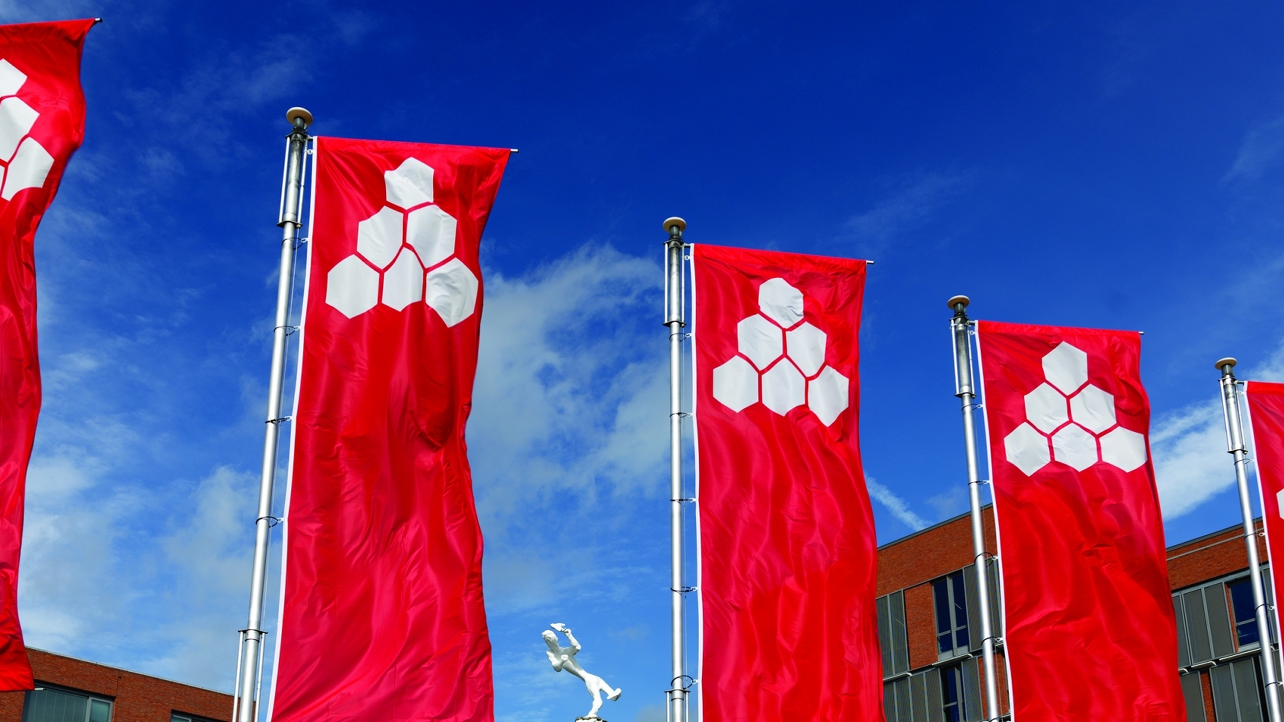
Banner masts should always have a turnover foot in a concrete base. Top-bar 130 cm, with a swivel mounting.
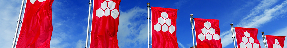
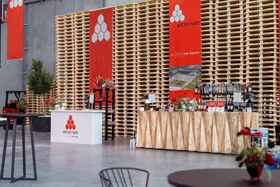
Banners and flags play a particularly important role in corporate image-building. Accordingly, these "representatives" should always be kept clean and in perfect condition!
Banners always in a series of 6 (spacing 2.5 m)
Premises
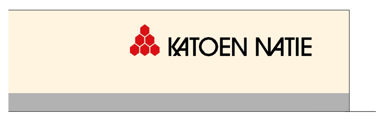
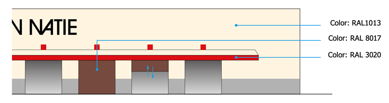
Facade panels for offices, warehouses, towers and other buildings are always in galvanised steel sheet with a polyester coating (Scintilla finish 200 m) and in the standard colour Mushroom SC or RAL 1013.
Signs
All signage on premises must follow consistent guidelines for typography, colours, and placement to maintain brand identity across all locations.
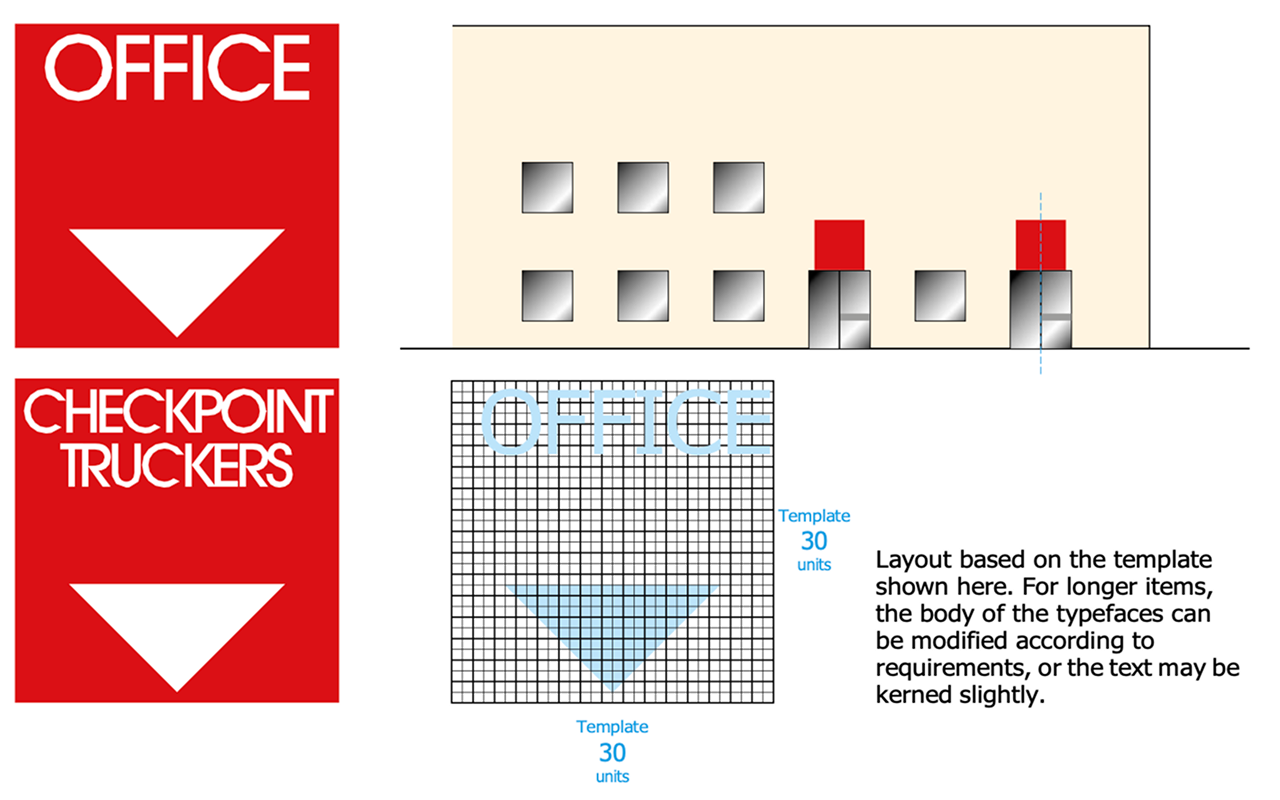
Office Signs
Office numbers are placed above the office entrance. Always use ITC Avant Garde Gothic Medium in capital letters, on the 30 units grid.
Colours: Background colour: RAL 3020. Text and arrow: reflecting white.
Material: Dibond 2 mm - RAL 3020
Size: 150 x 150 cm
Mounting: Mounted with painted pop rivets. Position: in the middle above the entrance door.
Layout based on the template shown here. For longer items, the body of the typefaces can be modified according to requirements, or the text may be kerned slightly.
Signs on Warehouses / Silos
The numbers are placed above the entrance. Always use ITC Avant Garde Gothic Medium in capital letters, on the 30 units grid.
Colours: Background colour: RAL 3020. Text: reflecting white.
Material: Dibond 2 mm - RAL 3020
Size: 50 x 50 cm
Mounting: Mounted with painted pop rivets. Position: in the middle above the gate.
Layouts based on the templates shown on the next page.
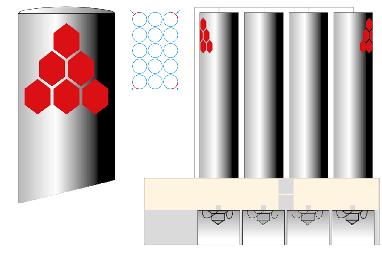
Numbers for Warehouses / Templates
Always use the 30 units grid.
Materials, size, colours and other technical info: see previous page
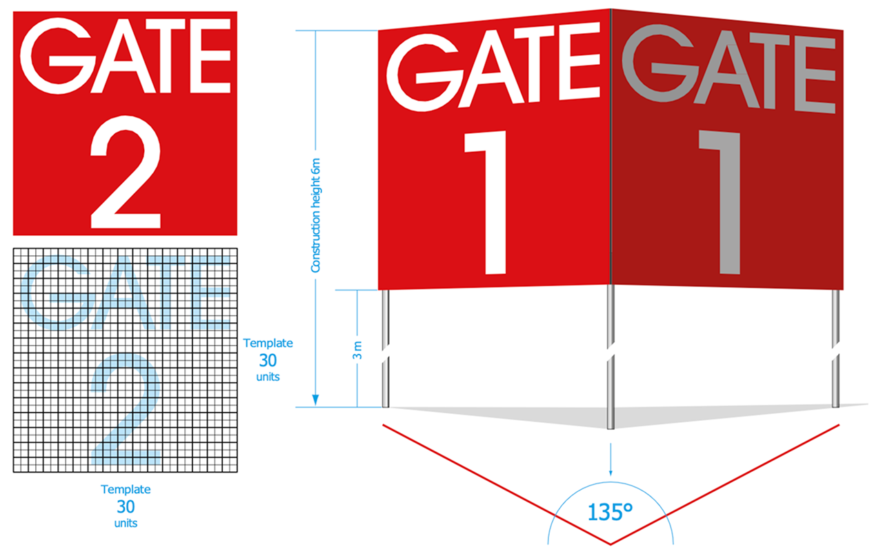
Main Entrance - Gate Numbers
Gate numbers are to be placed next to the gate entrance. Use ITC Avant Garde Gothic Medium in capital letters. The text should be designed on a 30 units grid.
Colours: Background colour: RAL 3020. Text colour: reflecting white.
Material: Galvanized iron construction in concrete base.
Construction height: 6 m (panel starts at 3 m from ground)
Mounting: Panels mounted with painted pop rivets.
Panels are mostly constructed as a pair, at an angle of 135° to benefit traffic in both directions.
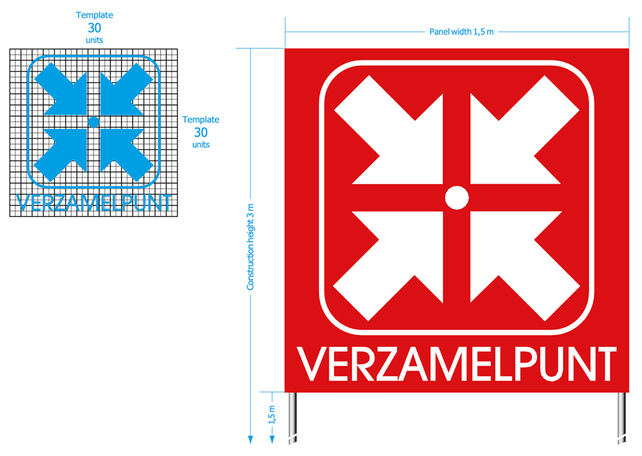
Assembly Point Signs
Assembly point signs follow the same guidelines as other premises signage. Use ITC Avant Garde Gothic Medium in capital letters on the 30 units grid, with RAL 3020 background and reflecting white text.
Examples
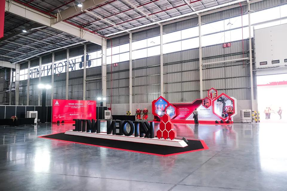
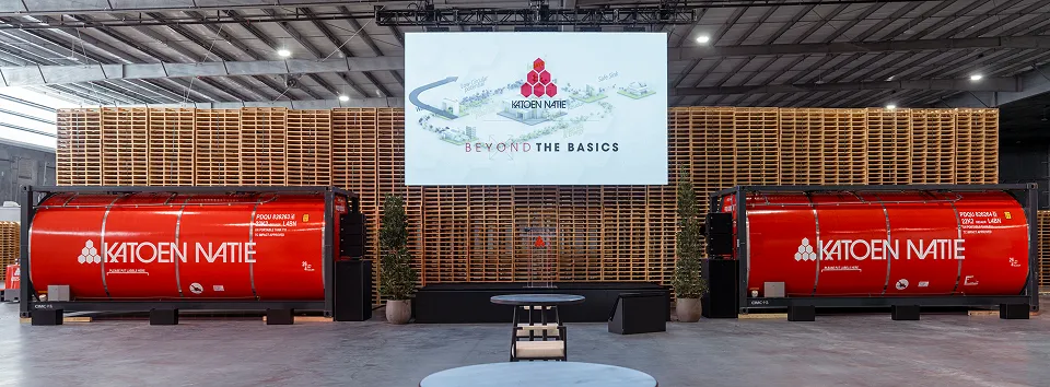
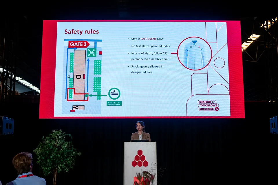
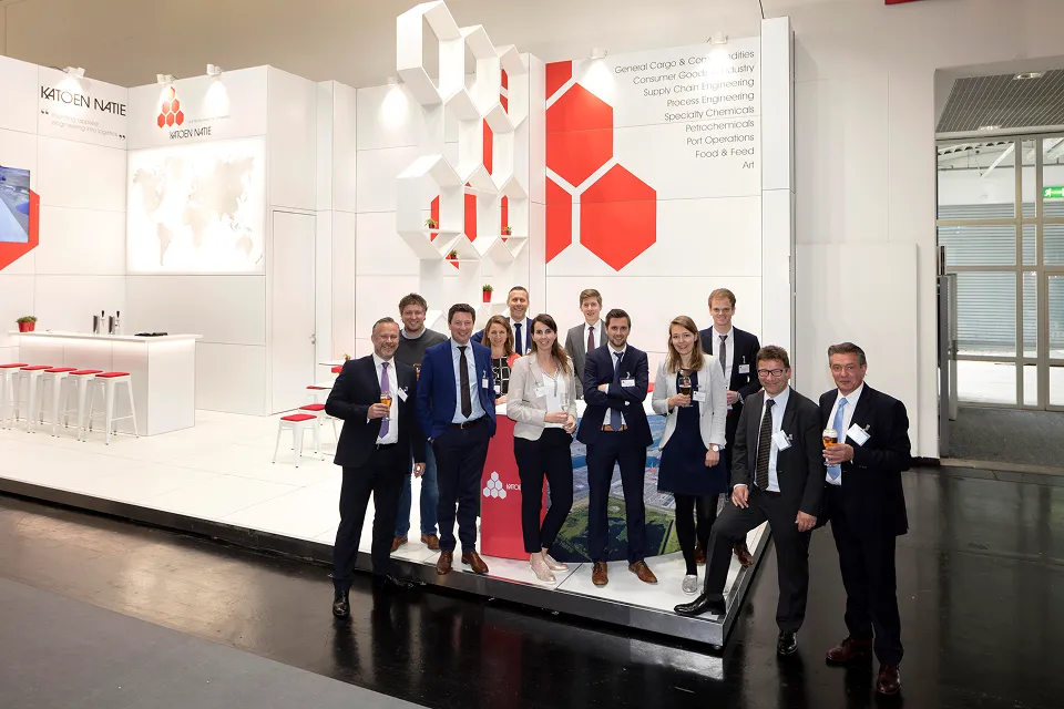
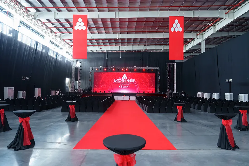
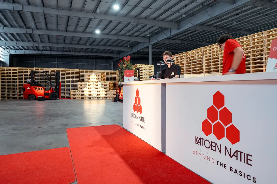
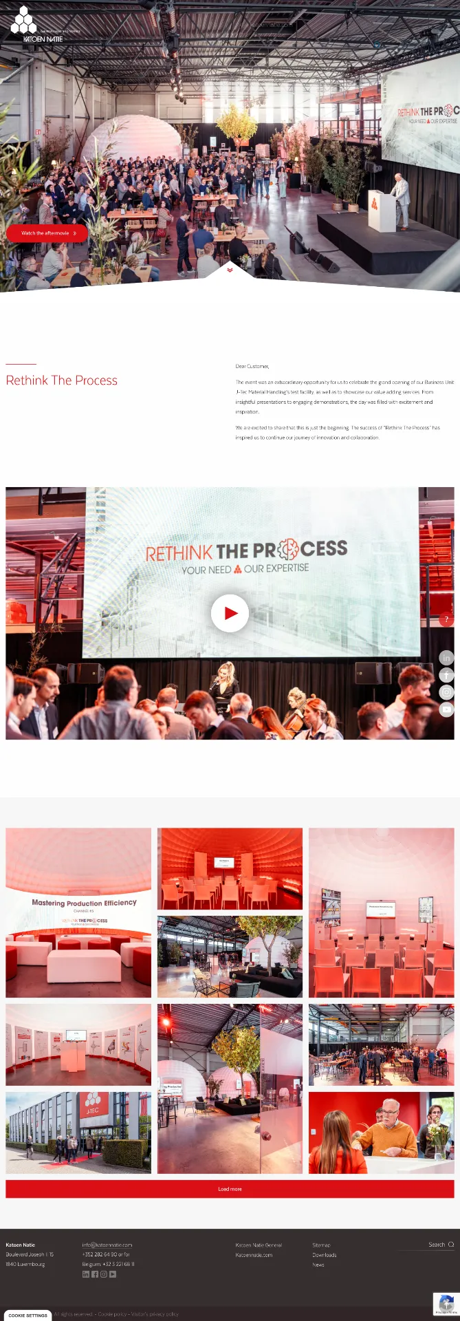
Fairs & Conferences
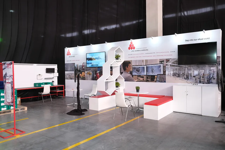
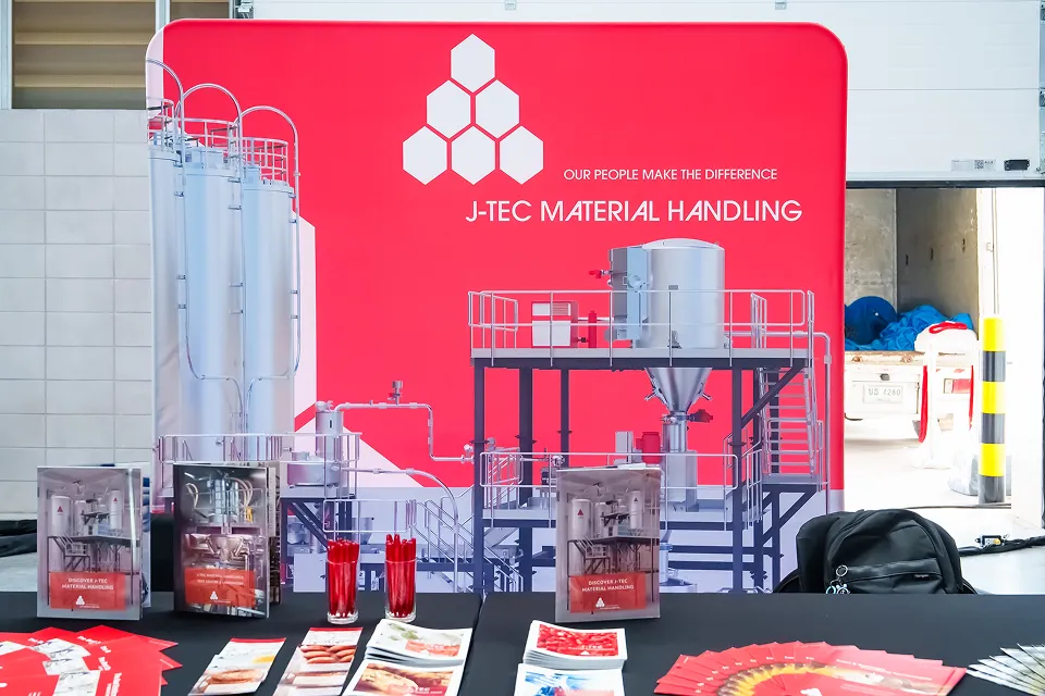
Commercial events
Landing page
We provide branded landing pages for event sign-ups on request. These pages are custom-designed to match the Katoen Natie brand guidelines and can be tailored to specific events, conferences, or commercial activities.
Download Kit
Access official assets, templates, and resources to help you apply the Katoen Natie brand correctly.
PowerPoint presentation
The Katoen Natie Copilot template is available directly on our intranet. Access it via the link below to create on-brand presentations using the approved Copilot Beta Testing design.
Tool Reference
Links to internal tools and platforms that support brand consistency.
Glossary
Common terms and definitions used within Katoen Natie brand guidelines.
- 2x Grid — A flexible layout system that uses divisions of two to create zones for content, creating visual rhythm and consistency.
- Branded House — Our brand architecture where the group brand sets core values, and business units apply these principles to their specific markets.
- Clear Space — The minimum amount of space that must surround the logo to ensure visibility and impact.
- Honeycomb — A key visual pattern representing our structured, interconnected network and operational efficiency.
Social Media
Effective social media content requires strategic planning, consistent branding, and platform-specific optimization. Focus on creating valuable, engaging content that tells your story while maintaining visual consistency across all channels.
Each platform has unique requirements and best practices. Use high-quality visuals, maintain your brand identity, and engage authentically with your audience. Regular posting schedules and data-driven insights help refine your strategy for maximum impact.
For further guidance or specific questions, please contact your Business Unit Communications & Marketing SPOC.